Living
Architecture
Logo Design

Living Architecture is a video series that illustrates the collaborative relationships formed between architect and client, and why people should consider an architect for a new build, renovation, or extension instead of alternative choices.
The series is a sub-brand that is driven and promoted by the master brand of the Institute. In this instance, Living Architecture aligns with the master brand but my task was to create a logo that could be used as a visual identity for the series. It was also requested that only black and white be used.
You can learn more about the series here at architecture.com.au/living-architecture
Exploration
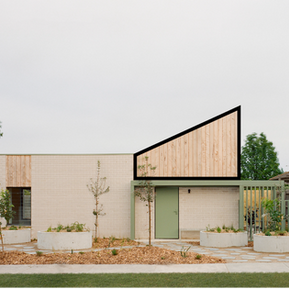
For this logo, a shape or icon function was requested to sit alongside the text 'Living Architecture', similar to how the crest in the Institute logo can be used separately from the text. I started exploring images of contemporary architecture, looking for repeating shapes, angles, lines etc., that could be used in the icon element of the logo. This rectangle-like shape caught my eye as a repeating pattern for interiors and exteriors. I wanted something bold and structural for the logo, similar to the way that new houses stand out among older houses in the street or how different materials stand alongside each other dividing different sections of the building.

Using this shape as a base, I then began to explore further what other shapes could be made, what lines would emerge and how they could connect and intersect with each other.
The connection of shapes seemed particularly important as it linked back to the purpose of the series, the relationship between client and architect.

Final concept
The final concept below encapsulates what I set out to achieve; an icon to sit alongside the title text, have a bold structural feel, and have some connection to the series. The intersection of the outline and filled shapes emerged as a great way to demonstrate this. The transparency (white sections), when placed over the video image or in a still, invites the project to be a part of the logo and title. The transparent sections also allow the logo to have a slightly different look and feel across each episode.
The logo was well received and is currently in use. You can view the latest Living Architecture episode here.


Logo application


