

UX Case Study


Project Overview
Problem
Event planners/staff spread their work over many different platforms that all serve a different function. This has resulted in unclear communication, missed opportunities, lost correspondence, difficulty in keeping track of where the event is up to and an inefficient use of staff time. To have one cohesive platform that would store all documents and information, have a timeline, checklist, guest list etc would make event planning more efficient and reduce the margin for error.
Scope and Deliverables
-
Desktop and mobile screens, working prototype
-
80 hours
My Role
UX/UI Design; User Research, Branding and UI elements, Prototyping and Useability Testing.
Discover
Research
Background
Despite the return of events in this post-pandemic climate, the standard for event planning remains undefined and ungoverned.
Planners need a platform to streamline their process, improve their performance and improve the event experience for planners and attendees.
Research Goals
We want to know:
-
tools that event planners are currently using
-
what aspects of event planning they are struggling
With a view to:
-
increase event bookings
-
increase revenue
Research Objectives
-
Investigate what tools are currently in use by event planners
-
Learn the strengths and weaknesses of the current platforms that are in use
-
Understand what event planners are currently struggling with
-
Understand what makes a good event and what makes a bad event
Competitive Analysis
I research the current tools available to the market to understand what they offer and possible gaps in these products. The research will also help establish a benchmark and guide my work.


Key Findings
Advantages
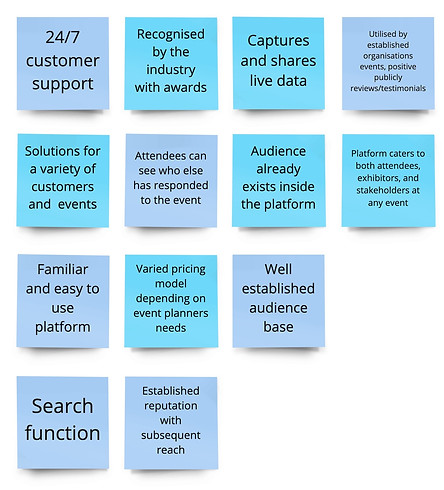
Disadvantages

User Interviews
I recruited six participants to interview with varying experience with event planning. Some are currently working solely as event planners and some organise events as apart of their business that they work in or own. My goal was to understand what tools are currently in use and what aspects of event planning they are struggling with.
Key Interview Findings
.jpg)
Define
Persona
"I am capable unless I tell you otherwise."
Event planners are independent and largely self managed. They ask for help when they need it.
Meet Kylie
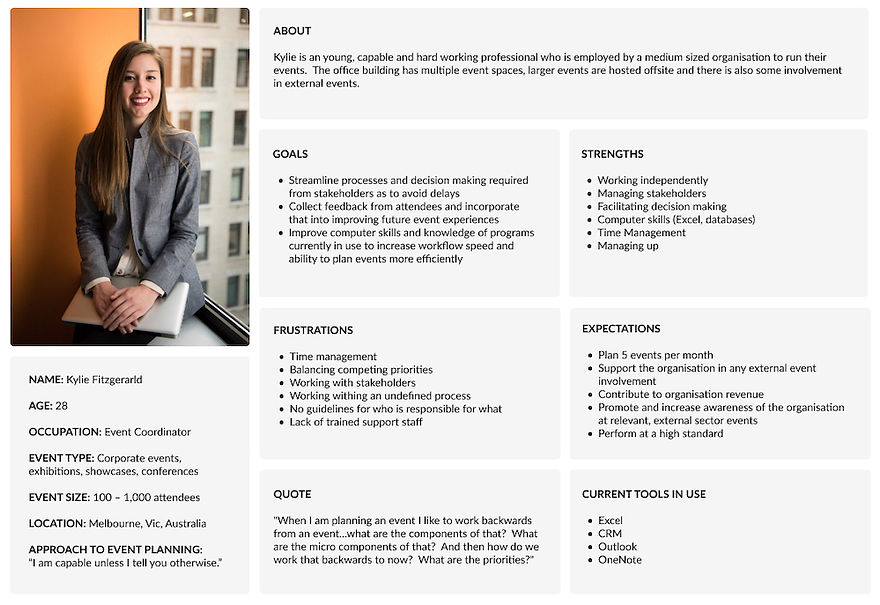
Business Goals & Users Goals
Ultimately, UI/UX is a tool that will help the business achieve its goals; increasing revenue and event bookings. It helps the business by creating a unique and memorable branded experience, increase staff productivity, clear communication channels and help collect and analyse data.
From the research undertaken and before moving into prototyping, it is important to considering how the goals of both groups can work inform the final product.

Low and Mid-fidelity Wireframes
After some sketching and using the taskflow above to create structure, wire-framing began as an exploration of page layouts to form the basis of a working prototype.
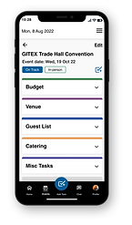
Consistent themes that emerged during user research was the need for visibility of how the event was progressing (from a business perspective) and the necessity of list making, task lists, to do lists etc. Focusing on this, the screens developed include home and event dashboards and the 'create a task' task flow.
Mid-fidelity Wireframes


Deliver
Branding & Visual Design
The branding decisions I have made here have focussed on industry trends (especially around colour palette), appealing to young professionals (persona) and inclusive design/accessibility guidelines.
Having completed the wireframing first helped me think about what elements I would need to hero in the branding which would then flow onto the UI. Also, what elements I would want or need to customise, such as custom icons, to really help establish the brand identity and connect it to user paths/goals etc.
Mood Board

Logo
Colour Palette

Typography

Iconography

Useability Acceptance Testing
I conducted moderated user acceptance testing (UAT) in person with five users. Some had participated in the user research undertaken, some had no prior knowledge of the platform. Users undertook the same test on both desktop and mobile prototypes.
I asked users to place themselves in the following scenario:
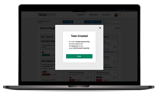
You are Kylie Fitzgerald, an event planner currently working on the GITEX Trade Hall Convention that is to take place on Monday, 19 October. You have received a new request from your manager and need to create a new task in TaskPath. This is a large event and you are working collaboratively so will be assigning the task to other team members too.

User Acceptance Testing – Iterations
100% of users were able to successfully complete the task
Generally speaking, the UAT conducted was a success but there are some changes that can be made to improve the overall user experience.
Priority changes – Mobile View
Profile Function
The profile function in footer is not attached to task flow, users intuitively attempted to logout through this button but it is not attached to the task flow.
Solution
Remove avatar from top navigation and add it to the footer to replace the profile icon. Add the hamburger icon the the navigation in place of the avatar.
Add Task Button
Adding a task is key to the task flow being tested and overall success of the platform but some users took some time to find the 'add task' button/icon. Partly this is because custom iconography has been used so it is not familiar to the user but improvements can be made to assist users.
Solution
Change the 'add task' button to the centre of the footer navigation and making it larger than the other icons so it stands out.
Before UAT

After UAT

Priority changes – Desktop View
Secondary Navigation
No users interacted with the secondary navigation on the desktop view during user acceptance testing. This is not necessarily a bad thing but there may be a way to highlight it to users so that they could add a task to the dashboard quicker.
Solution
Consider changing the secondary navigation to the current hover state, so from white to blue, so that it stands out more against the background and maintains a higher contrast to the other UI elements.
Before UAT

After UAT

Other changes
-
During UAT some users attempted to view the details they had created once the task was complete. This functionality was not present but I have added the functionality to the dashboard.
-
During UAT the task at hand did not require scrolling on the desktop event dashboard despite the functionality being present. I have added a scroll bar to the UI of the event dashboard to that there is an indicator for more content.


Final Thoughts
Challenges
Working on this product was a challenge but ultimately I think it has the potential to be a useful product for users. As the sole designer it really forced me to complete all aspects of the design process and make all the design decisions, supported by my mentor. This pushed me to listen to the users and really let that voice inform the process.
Working on a product in which user research has been apart of the design process is new for me but ultimately, I believe, makes for a better product. I really learned the value of the voice of the user and the positive influences that they can have on the design process.
Overall though, this product has the potential to be a viable solution for event planners; a cohesive platform to reduce the margin for error throughout the event planning process.
The iterations that were made after UAT were not changes that I (as a the designer) could have anticipated but I can agree that they improved the UI/UX of the final design.
Next Steps
Next steps in this project would be to continue to build out the features already alluded too to add to the platforms functionality and it's ability to handle more complex events.
There would also be value in undertaking more UAT with new features and with participants who would be the target user group of the product.